<Form>
<Form> renders a configurable form that can be used to sign in or sign up users. A <ConfigurationProvider> needs to be rendered as a parent component, preferably near the application root component to reduce the number of re-renders.
Usage
import { ConfigurationProvider, Form } from "@slashid/react"
import "@slashid/react/style.css"

function SignIn() {
  return (
    <ConfigurationProvider>
      <Form />
    </ConfigurationProvider>
  )
}
The default styles must be imported:
import "@slashid/react/style.css"
Note: if using Parcel the CSS import line should be changed to:
import "@slashid/react/dist/style.css"
Props
| Name | Type | Default | Description |
|---|---|---|---|
| onSuccess? | (user: User) => void | Callback function that gets called with a User object returned from core SDK upon successful log in action | |
| onError? | (error: Error, context: ErrorContext) => void; | Callback function that gets called with a User object returned from core SDK upon log in action failure | |
| middleware? | LoginMiddleware | LoginMiddleware[] | Effects to be run post-login but before onSuccess fires, and before the next render cycle. See LoginMiddleware for more. | |
| factors? | Factor[] | Override for the available authentication factors set by <ConfigurationProvider>. | |
| text? | Record<string, string> | Overrides for the text shown in the form. See <ConfigurationProvider> text overrides. | |
| children? | Slot<"initial" | "authenticating" | "error" | "success" | "footer"> | Named slots to be replaced with custom implementation. |
Interfaces
When working with the onError prop, the ErrorContext type can be used to determine the context in which the error occurred. The following table lists the possible values of the context property:
type ErrorContext = {
  config: LoginConfiguration // handle and factor used to log in
  options?: LoginOptions // any middleware used to configure login
  attempt: number // number of login attempts
  error: Error // the error that occurred
}
Configuration should be done through the <ConfigurationProvider>, but if you wish you can override it using the factors and text props.
UI customization
The primary way of customizing the form appearance is by using CSS custom properties. Additionally, the individual form element styles can be overridden using plain CSS.
CSS custom properties (variables)
A set of CSS custom properties is used to define the basic look and feel of the <Form>. There are two ways of overriding the default values of these properties:
- use a global CSS selector:
sid-theme-root - passing in a custom class name to the
<Form>using theclassNameprop
Both of these approaches can be used to specify any of the following properties values:
--sid-color-foreground
--sid-color-background
--sid-color-primary
--sid-color-primary-hover
--sid-color-secondary
--sid-color-tertiary
--sid-color-mute
--sid-color-panel
--sid-color-contrast
--sid-color-placeholder
--sid-color-smooth
--sid-color-subtle
--sid-color-soft
--sid-color-offset
--sid-color-transparent
--sid-font-family
--sid-button-border-radius
For example, in order to the change the font-family you could specify the following:
.sid-theme-root {
  --sid-font-family: Inter
}
Overriding CSS rules
If you inspect the form elements using the developer tools in your browser, you'll notice that they have a set of class names applied. Within this set some class names are stable, while others are hash based and dynamic. Class names prefixed by sid-- are stable and act as a public API for overriding the CSS rules. For example, you could customize the button element by using a selector like this:
.sid-button {
  color: red;
}
Layout slots & primitives
The form layout is composed of a set of named slots that can be used to customize the layout. The slots and their rendering conditions are as follows:
initial- rendered when the form is first displayed, can be used to render the form fieldsauthenticating- rendered while the user is being authenticatederror- rendered when an error occurssuccess- rendered when the user is successfully authenticatedfooter- rendered at the bottom of the form, regardless of the form state
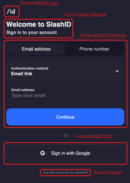
When rendering Form without replacing any slots with custom components, it will render in its default state. The following screenshot shows the default form layout in the initial state with the slots outlined:
The following example shows how to use these slots:
import { Slot, Form } from "@slashid/react"

function CustomForm() {
  return (
    <Form>
      <Slot name="authenticating">
        <p>Please wait...</p>
      </Slot>
      <Slot name="success">
        <p>You are logged in!</p>
      </Slot>
      <Slot name="error">
        <p>An error happened!</p>
      </Slot>
      <Slot name="footer">
        <footer>My custom footer</footer>
      </Slot>
    </Form>
  )
}
We haven't used the initial slot in this example, so the default form fields will be rendered. If you also want to customise the way the form fields are being rendered, you can compose the <Form> using the primitives we export under the Form namespace.
Composing a custom Form
Check the Form composition guide for a more detailed explanation of how to compose a custom form.
When replacing the default form fields using <Slot name="initial">, you can use a set of primitives designed to make it easier to compose the form. In order to use these knowing a couple of interfaces will be helpful:
Interfaces
FactorHandleHandleTypeFormStatus- one of"valid"or"invalid"
Primitives - Form.Initial namespace
The primitive components used to build out the initial state of the form are all exposed under the Form.Initial namespace. This namespace has the following components:
| Component | Children as a function props | Description |
|---|---|---|
Form.Initial.Logo | Renders the configured logo. | |
Form.Initial.Header | Renders the header with text content. | |
Form.Initial.Controls | { factors: Factor[], handleTypes: HandleType[], handleSubmit: (factor: Factor, handle?: Handle) => void } | Wraps children with a <form> that has a submit listener attached. |
Form.Initial.SSO | Renders a button per each configured SSO factor. |
The form is designed to be composed of these primitives. You can add additional components of your own anywhere within the slot.
The Form.Initial.Controls component is the most complex one, as it renders the form fields and the submit button. We can break the form down further by passing children to this component. There are two options for passing children to this component:
- building a completely custom form by passing in a function as a child
- passing in a
ReactNodeas a child and composing the form fields using the primitives from theForm.Initial.Controlsnamespace and your components
The following table lists the components that can be used to compose the form fields:
| Component | Children as a function props | Description |
|---|---|---|
Form.Initial.Controls.Input | { factors: Factor[], handleTypes: HandleType[] } | Renders the appropriate form fields based on the factors being used. |
Form.Initial.Controls.Submit | { status: FormStatus } | Renders the submit button. |
You can freely mix and match these components to create your own form layout. Any children passed to <Slot name="initial"> will be rendered accordingly, including the primitives listed above and your own components.
Alternatively they accept children as a function, which is called with the props listed above. This will make you responsible for rendering the UI, while giving you access to the props to reuse the behaviour of the default implementation. For example:
function ComposedForm({ handleSubmit }) {
  const [email, setEmail] = useState("")

  return (
    <form
      onSubmit={(e) => {
        e.preventDefault()
        handleSubmit({ method: "email_link" }, { type: "email_address", value: email })
      }}
    >
      <input type="email" value={email} onChange={(e) => setEmail(e.target.value)} />
      <Form.Initial.Controls.Submit />
    </form>
  )
}
Primitives - Form.Error namespace
This namespace contains a single component used to render the UI of the Form when an error occurs:
| Component | Children as a function props | Description |
|---|---|---|
Form.Error | { context: ErrorContext, retry: () => void, cancel: () => void } | Renders the form UI in case of an error. |
When passing a function as children to this component, this function will be called with the same ErrorContext object as the onError prop. This gives you access to the underlying error object and other useful metadata like the number of login attempts. The retry and cancel functions can be used to retry the login action or cancel it respectively. retry will submit the form with the same payload as it was used in the original attempt, while cancel will reset the form to its initial state.
Composition example
We first created our own <ComposedForm> component that renders a form with a custom email input and a submit button that uses the default implementation. We then wrap this component with <Form.Initial.Controls> to get access to the handleSubmit prop, which we use to submit the form:
import { Slot, Form } from "@slashid/react"

function CustomForm() {
  return (
    <Form>
      <Slot name="initial">
        <Form.Initial.Controls>
          {({ handleSubmit }) => {
            return <ComposedForm handleSubmit={handleSubmit} />
          }}
        </Form.Initial.Controls>
      </Slot>
    </Form>
  )
}
In this contrived example we illustrated how to compose the form using our primitives or your own components. In practice you'll probably want to use the default implementation for most of the form fields, and only replace the ones you want to customize.
Multi-Factor Authentication
See <MultiFactorAuth> component reference.